基本配置

画任何图片之前,先运行下面这段代码,包括导包,调整字体,字号,清晰度等等.

1
2
3
4
5
6
7
8
9
10
11
12
13
14
15
16
17
18
19
import pandas as pd
import numpy as np
import matplotlib.pyplot as plt
import matplotlib.ticker as ticker
# 基础设置
# 设置全局字体为Times New Roman
plt.rcParams['font.family'] = 'Times New Roman'
# 设置字号为12pt
plt.rcParams['font.size'] = 32

# 设置全局变量,使得图例的大小为26pt
plt.rcParams['legend.fontsize'] = 26
# 设置全局变量,使得text的大小为20pt
fontsize_text = 20
plt.rcParams['axes.titlesize'] = fontsize_text
# 设置全局变量
# 清晰
%config InlineBackend.figure_format = 'retina'
%matplotlib inline

线形图

以华数杯的这个线形图为例,同时这个代码也展示了怎么开双轴.

小tip:如果横坐标需要显示为整数,但却自动变为小数,可以把该坐标调成str格式.

1
2
3
4
5
6
7
8
9
10
11
12
13
14
15
16
17
18
19
20
21
fig_wind,ax_wind = plt.subplots(figsize=(16,8))
ax_wind.plot(df['time'][0:9].astype(str),df['风电生产电力量(亿千瓦小时)'][0:9],'o--',color='#709ED0',linewidth=3,label='Inverse conjecture data')
ax_wind.plot(df['time'][8:-1].astype(str),df['风电生产电力量(亿千瓦小时)'][8:-1],'o-',color='#3C979F',linewidth=3,label = 'Real data')
ax_wind.set_xlabel('Year')
ax_wind.set_ylabel(r'Electricity Production($\mathrm{1\cdot 10^8}$KWh)', fontproperties='Times New Roman')
ax_wind.grid(True)
ax_wind.legend(loc='upper left')
for i in range(0,len(df['time'])-1):
ax_wind.text(df['time'][i].astype(str),df['风电生产电力量(亿千瓦小时)'][i]+70,round(df['风电生产电力量(亿千瓦小时)'][i],2),ha='center',va='bottom',fontsize=fontsize_text)
ax_wind.xaxis.set_major_locator(ticker.MultipleLocator(2))
ax2_wind = ax_wind.twinx()
# 设置这个轴的颜色为蓝色
ax2_wind.spines['right'].set_color('white')
ax2_wind.set_ylim(0,1)
# 清洁能源百分比的英文为:Percentage of Clean Energy
ax2_wind.tick_params(axis='y', length=0, pad=-10) # 设置y轴刻度的长度为0,并且把刻度与轴的距离设置为-10
ax2_wind.set_ylabel('Percentage',color = 'white')
ax2_wind.set_yticks(np.linspace(0,1,11)) # 设置y轴的刻度为0-1,共11个
# 设置这个轴的颜色为黑色
ax2_wind.spines['right'].set_color('black')
ax2_wind.set_yticklabels([str(i*10)+'%' for i in range(0,11)],color = 'white')

效果如下:

堆叠图

1
2
3
4
5
6
7
8
9
10
11
12
13
14
15
16
17
18
19
20
21
22
23
24
25
26
27
28
29
30
31
32
33
34
35
36
37
38
39
40
41
42
43
44
45
46
47
fig , ax = plt.subplots(figsize=(16,8))
colors = ['#416F5D','#709ED0']
clean = df['核电生产电力量(亿千瓦小时)'] + df['水电生产电力量(亿千瓦小时)'] +df['风电生产电力量(亿千瓦小时)']
pollution = df['火电生产电力量(亿千瓦小时)']
ax.stackplot(df['time'].astype(str) , clean,pollution,colors=colors,labels=['Clean','Pollution'],alpha=0.8)
# 把legend放到左上角
ax.legend(loc='upper left')
# 在每个点上画出数值
# for i in range(0,len(df['time'])-1):
# ax.text(df['time'][i].astype(str),clean[i]+pollution[i],round(clean[i]+pollution[i],2),ha='center',va='bottom',fontsize=15)
# 在右边加一列新的坐标轴,并且设置为百分比
ax2 = ax.twinx()
# 设置这个轴的颜色为蓝色
ax2.spines['right'].set_color('#3C979F')
ax2.set_ylim(0,1)
# 清洁能源百分比的英文为:Percentage of Clean Energy

ax2.set_ylabel('Percentage',color = '#3C979F')
ax2.set_yticks(np.linspace(0,1,11)) # 设置y轴的刻度为0-1,共11个
ax2.set_yticklabels([str(i*10)+'%' for i in range(0,11)],color = '#3C979F')
# 在图中新画一条折线,表示clean的占比
ax2.plot(df['time'].astype(str),clean/(clean+pollution),'o',color='#3C979F',linestyle='--',linewidth=3,label='Percentage of Clean Energy',markevery=2)
for i in range(0,len(df['time']),2):
ax2.text(df['time'][i].astype(str),clean[i]/(clean[i]+pollution[i])+0.01,str(round(clean[i]/(clean[i]+pollution[i])*100,2))+'%',ha='center',va='bottom',fontsize = 20)
ax2.legend(loc='upper right')
fig.tight_layout()
ax.set_xlabel('Year')
ax.set_ylabel('Electricity Production ($1\cdot 10^8$KWh)')
ax.grid(True,alpha = 0.3)
# 获取 ax 的图例句柄和标签
handles1, labels1 = ax.get_legend_handles_labels()

# 获取 ax2 的图例句柄和标签
handles2, labels2 = ax2.get_legend_handles_labels()

# 合并所有的图例句柄和标签
handles = handles1 + handles2
labels = labels1 + labels2

# 创建一个新的图例
fig.legend(handles, labels, loc=(0.14,0.72),prop = {'size':28})

# 移除原来的图例
ax.get_legend().remove()
ax2.get_legend().remove()

ax.xaxis.set_major_locator(ticker.MultipleLocator(2))

效果如下:

比例图

比例图以封装成一个函数,画图时只用改变results和category_names
由于legend是放在图片外面,故图片真实大小不是(16,8),故调整为(22,11),字体也随之按比例改变
代码如下:

1
2
3
4
5
6
7
8
9
10
11
12
13
14
15
16
17
18
19
20
21
22
23
24
25
26
27
28
29
30
31
32
33
34
35
36
37
38
39
40
41
42
43
44
45
46
47
48
49
50
51
52
53
54
55
56
57
58
59
60
61
category_names = ['Wildlife protection section','Natural reserve section','Ecological restoration section','Ecological compensation section']
results = {
'Wildlife':[0.51,0.25,0.06,0.18],
'Human':[0.14,0.1,0.35,0.41],
'Livestock':[0.16,0.29,0.12,0.44]
}
def survey(results, category_names):
"""
Parameters
----------
results : dict
A mapping from question labels to a list of answers per category.
It is assumed all lists contain the same number of entries and that
it matches the length of *category_names*.
category_names : list of str
The category labels.
"""
labels = list(results.keys())
data = np.array(list(results.values()))
data_cum = data.cumsum(axis=1)
category_colors = ['#416F5D', '#3C979F', '#709ED0', '#A1608C', '#CF948E']

fig, ax = plt.subplots(figsize=(22,11))
ax.invert_yaxis()
ax.xaxis.set_visible(True)
ax.set_xlim(0, 1) # Set x-axis limits to 0 and 1 for percentage

ax.tick_params(axis='y',labelsize = 44)
ax.tick_params(axis='x',labelsize = 44)
# Format x-axis labels as percentages
ax.xaxis.set_major_formatter(mticker.FuncFormatter('{:.0%}'.format))
ax.set_xticks(np.arange(0, 1.1, 0.2)) # Set x-axis ticks at every 20%

for i, (colname, color) in enumerate(zip(category_names, category_colors)):
widths = data[:, i]
starts = data_cum[:, i] - widths
rects = ax.barh(labels, widths, left=starts, height=0.5,
label=colname, color=color, edgecolor='black', linewidth=2)

r, g, b = matplotlib.colors.to_rgb(color)
text_color = 'white' if r * g * b < 0.5 else 'darkgrey'
for rect in rects:
width = rect.get_width()
ax.text(rect.get_x() + width / 2,
rect.get_y() + rect.get_height() / 2,
"{:.0%}".format(width),
ha='center',
va='center',
color=text_color,
weight='bold')
ax.legend(ncols=1, bbox_to_anchor=(1, 1),
loc='upper left', fontsize=22/16*26)

# Set the thickness of the axis spines
for spine in ax.spines.values():
spine.set_linewidth(2)

return fig, ax

survey(results, category_names)
plt.show()

效果如下:

热力图

和比例图类似,热力图中的字体大小也需要另外调整,现已经在函数中修改:
函数代码:

1
2
3
4
5
6
7
8
9
10
11
12
13
14
15
16
17
18
19
20
21
22
23
24
25
26
27
28
29
30
31
32
33
34
35
36
37
38
39
40
41
42
43
44
45
46
47
48
49
50
51
52
53
54
55
56
57
58
59
60
61
62
63
64
65
66
67
68
69
70
71
72
73
74
75
76
77
78
79
80
81
82
83
84
85
86
87
88
89
90
91
92
93
94
95
96
97
98
99
100
101
102
103
104
105
106
107
108
109
110
111
112
113
114
115
116
117
118
119
120
def heatmap(data, row_labels, col_labels, ax=None,
cbar_kw=None, cbarlabel="", **kwargs):
"""
Create a heatmap from a numpy array and two lists of labels.

Parameters
----------
data
A 2D numpy array of shape (M, N).
row_labels
A list or array of length M with the labels for the rows.
col_labels
A list or array of length N with the labels for the columns.
ax
A `matplotlib.axes.Axes` instance to which the heatmap is plotted. If
not provided, use current axes or create a new one. Optional.
cbar_kw
A dictionary with arguments to `matplotlib.Figure.colorbar`. Optional.
cbarlabel
The label for the colorbar. Optional.
**kwargs
All other arguments are forwarded to `imshow`.
"""

if ax is None:
ax = plt.gca()

if cbar_kw is None:
cbar_kw = {}

# Plot the heatmap
im = ax.imshow(data, **kwargs)

# Create colorbar
cbar = ax.figure.colorbar(im, ax=ax, **cbar_kw)
cbar.ax.set_ylabel(cbarlabel, rotation=-90, va="bottom",fontsize = 20)
cbar.ax.tick_params(labelsize=20)
# Show all ticks and label them with the respective list entries.
ax.set_xticks(np.arange(data.shape[1]), labels=col_labels)
ax.set_yticks(np.arange(data.shape[0]), labels=row_labels)

# 调整字体大小
ax.set_xticklabels(ax.get_xticklabels(), fontsize=20)
ax.set_yticklabels(ax.get_yticklabels(), fontsize=20)
# Let the horizontal axes labeling appear on top.
ax.tick_params(top=True, bottom=False,
labeltop=True, labelbottom=False)

# Rotate the tick labels and set their alignment.
plt.setp(ax.get_xticklabels(), rotation=-30, ha="right",
rotation_mode="anchor")

# Turn spines off and create white grid.
ax.spines[:].set_visible(False)

ax.set_xticks(np.arange(data.shape[1]+1)-.5, minor=True)
ax.set_yticks(np.arange(data.shape[0]+1)-.5, minor=True)
ax.grid(which="minor", color="w", linestyle='-', linewidth=3)
ax.tick_params(which="minor", bottom=False, left=False)

return im, cbar


def annotate_heatmap(im, data=None, valfmt="{x:.2f}",
textcolors=("black", "white"),
threshold=None, **textkw):
"""
A function to annotate a heatmap.

Parameters
----------
im
The AxesImage to be labeled.
data
Data used to annotate. If None, the image's data is used. Optional.
valfmt
The format of the annotations inside the heatmap. This should either
use the string format method, e.g. "$ {x:.2f}", or be a
`matplotlib.ticker.Formatter`. Optional.
textcolors
A pair of colors. The first is used for values below a threshold,
the second for those above. Optional.
threshold
Value in data units according to which the colors from textcolors are
applied. If None (the default) uses the middle of the colormap as
separation. Optional.
**kwargs
All other arguments are forwarded to each call to `text` used to create
the text labels.
"""

if not isinstance(data, (list, np.ndarray)):
data = im.get_array()

# Normalize the threshold to the images color range.
if threshold is not None:
threshold = im.norm(threshold)
else:
threshold = im.norm(data.max())/2.

# Set default alignment to center, but allow it to be
# overwritten by textkw.
kw = dict(horizontalalignment="center",
verticalalignment="center")
kw.update(textkw)

# Get the formatter in case a string is supplied
if isinstance(valfmt, str):
valfmt = matplotlib.ticker.StrMethodFormatter(valfmt)

# Loop over the data and create a `Text` for each "pixel".
# Change the text's color depending on the data.
texts = []
for i in range(data.shape[0]):
for j in range(data.shape[1]):
kw.update(color=textcolors[int(im.norm(data[i, j]) > threshold)])
text = im.axes.text(j, i, valfmt(data[i, j], None),fontsize = 20, **kw)
texts.append(text)

return texts

数据代码:

1
2
3
4
5
6
7
8
9
10
11
12
13
14
# 每行的数据名
vegetables = ["cucumber", "tomato", "lettuce", "asparagus",
"potato", "wheat", "barley"]
# 每列的数据名
farmers = ["Farmer Joe", "Upland Bros.", "Smith Gardening",
"Agrifun", "Organiculture", "BioGoods Ltd.", "Cornylee Corp."]
# 数据
harvest = np.array([[0.8, 2.4, 2.5, 3.9, 0.0, 4.0, 0.0],
[2.4, 0.0, 4.0, 1.0, 2.7, 0.0, 0.0],
[1.1, 2.4, 0.8, 4.3, 1.9, 4.4, 0.0],
[0.6, 0.0, 0.3, 0.0, 3.1, 0.0, 0.0],
[0.7, 1.7, 0.6, 2.6, 2.2, 6.2, 0.0],
[1.3, 1.2, 0.0, 0.0, 0.0, 3.2, 5.1],
[0.1, 2.0, 0.0, 1.4, 0.0, 1.9, 6.3]])

3D条形图

数据格式与数据导入方式:

1
2
3
4
5
6
7
8
9
10
11
12
13
14
import pyecharts.options as opts
from pyecharts.charts import Bar3D

# 将DataFrame的列转换为列表
hours = df_mean['hour'].tolist()
months = df_mean['month'].tolist()
irradiance = df_mean['Gh [Wh/m2]'].tolist()

# 创建一个新的数据列表
data = [[hours[i], months[i], irradiance[i]] for i in range(len(hours))]

hours_index = [i for i in range(24)]
months_index = [i for i in range(1,13)]
print(radiation_sums)

可以用pyecharts画图,但是没有阴影,为了阴影效果,使用js来画:

echarts链接

用js画图,数据需要直接写出来,为了方便复制,下面提供一种把数据写入到txt文件的代码

1
2
3
4
5
6
7
8
9
# 把hours_index 放到一个txt文件中:
with open('../data/hours_index.txt','w') as f:
f.write(str(hours_index))
# 把data按照原格式放到一个txt文件中,保留[]:
with open('../data/data.txt','w') as f:
f.write('[')
for i in range(len(data)):
f.write(str(data[i])+',')
f.write(']')

画图代码:

1
2
3
4
5
6
7
8
9
10
11
12
13
14
15
16
17
18
19
20
21
22
23
24
25
26
27
28
29
30
31
32
33
34
35
36
37
38
39
40
41
42
43
44
45
46
47
48
49
50
51
52
53
54
55
56
57
58
59
60
61
62
63
64
65
66
67
68
69
70
// prettier-ignore
var days = ['12a', '1a', '2a', '3a', '4a', '5a', '6a',
'7a', '8a', '9a', '10a', '11a',
'12p', '1p', '2p', '3p', '4p', '5p',
'6p', '7p', '8p', '9p', '10p', '11p'];
// prettier-ignore
var hours = [1,2,3,4,5,6,7,8,9,10,11,12];
// prettier-ignore
var data = [[]]//太长了,隐去
var colors = ['#9CBB89','#769464','#526F41','#2F4C21','#102B00']
option = {
tooltip: {},
visualMap: {
max: 400,
inRange: {
color: ['#9CBB89','#769464','#526F41','#2F4C21','#102B00']
}
},
xAxis3D: {
type: 'category',
data: hours
},
yAxis3D: {
type: 'category',
data: days
},
zAxis3D: {
type: 'value'
},
grid3D: {
boxWidth: 80,
boxDepth: 200,
viewControl: {
// projection: 'orthographic'
},
light: {
main: {
intensity: 1.2,
shadow: true
},
ambient: {
intensity: 0.3
}
}
},
series: [
{
type: 'bar3D',
data: data.map(function (item) {
return {
value: [item[1], item[0], item[2]]
};
}),
shading: 'lambert',
label: {
fontSize: 16,
borderWidth: 1
},
emphasis: {
label: {
fontSize: 20,
color: '#900'
},
itemStyle: {
color: '#900'
}
}
}
]
};

效果如下:

色系表

色系 颜色1 颜色2 颜色3 颜色4 颜色5
灰色系 #353C3E #7A7579 #A59B95 #DDD7D3 #EFEDEC
红色系 #7E3527 #A44A44 #9B593E #B47C74 #D0B4A9
绿色系 #535952 #616153 #7F8D7B #9AA193 #CADABD
紫色系 #723E58 #8F7EAB #8A7B93 #A38FA3 #D8D1E1
粉色系 #D59DA5 #CDA59E #D5ACBE #E8C2DB #F1DADB
蓝色系 #475169 #4B5C74 #7D90A5 #A1B2CC #C6CEE2
褐色系 #8E6A49 #9F814E #BCA272 #D1BFAC #E5CFBE
黄色系 #AB845E #D3AE5B #CDB97D #EEECC3 #FBEEDE
橙色系 #AF665A #D3A56E #CB9C7A #E0C9B1 #E7DFD7
色系 颜色1 颜色2 颜色3 颜色4 颜色5
粉色 #CF948E #DE7E81 #F5C6C6 #F2B3CA #F0C9D6
紫色 #A1608C #9B6F89 #D9BCD6 #E8E3EC #EDEDEE
蓝色 #709ED0 #ACBEDD #C6CCDF #DFE2E3 #EFF2F7
靛色 #3C979F #A7D0D8 #75A5B8 #ABCCDD #DBE1F0
绿色 #416F5D #638262 #628D3D #96B23C #9CBB89
桃棕色 #C64E2F #C86A58 #C46F4D #CA8F7A #F0C9BA
红橙色 #991B27 #BD2630 #E64F25 #ED884C #F1A183
现代色 #7083A6 #ADC0DA #954B63 #E094B2 #EEACCB

地图

地图主要使用folium包绘制

导包代码:

1
2
3
4
5
6
import folium
import pandas as pd
import numpy as np
import webbrowser as wb
from folium.plugins import HeatMap
from folium.plugins import MarkerCluster

读取数据,初始化地图:

1
2
3
4
5
6
7
8
9
10
11
12
13
14
15
archive = pd.read_csv('../data/dataset_of_vctria.csv')
latitudes = archive['latitude'].head(3000)
longitudes = archive['longitude'].head(3000)
m = folium.Map(location = [np.mean(latitudes),np.mean(longitudes)],
width = '100%',
height = '100%',
zoom_start = 5,#缩放比例
min_zoom = 0,
max_zoom=18,
tiles='OpenStreetMap',
attr = '高德地图'
)
m.add_child(folium.LatLngPopup()) # 点击显示经纬度
# 经纬度数据:
heat_data = [[row['latitude'],row['longitude']] for index,row in archive.iterrows()] # 热力图数据:经纬度

画圈函数:

1
2
3
4
5
6
7
8
9
10
11
12
13
14
def pointpoint(m,latitude,longitude):
point = folium.map.FeatureGroup()
for lat,lon in zip(latitude,longitude):
point.add_child(
folium.CircleMarker(
[lat,lon],
radius = 2,
color = 'red',
fill = True,
fill_color = 'red',
fill_opacity = 1,
)
)
m.add_child(point)

栅格化函数:

1
2
3
4
5
6
7
8
9
10
11
12
def grid_func(latitude_start,longitude_start,latitude_size,longitude_size,latitude_num,longitude_num,color,alpha,m):
for i in range(int(longitude_num)):
for j in range(int(latitude_num)):
folium.Polygon(
[
[latitude_start +latitude_size*j,longitude_start +i*longitude_size],
[latitude_start +latitude_size*j,longitude_start +(i+1)*longitude_size],
[latitude_start +latitude_size*(j+1),longitude_start +(i+1)*longitude_size],
[latitude_start +latitude_size*(j+1),longitude_start +i*longitude_size],
],
color = color,weight=1,fill=True,fill_color=color,fill_opacity=alpha,
).add_to(m)

找到格子左下角坐标的函数(用于后续给格子填色)

1
2
3
4
5
6
7
# 找到格子左下角坐标的函数:
def find_left_down(latitude_start,longitude_start,latitude_size,longitude_size,latitude_grid,longitude_grid):
return [latitude_start +((latitude_grid-latitude_start)//latitude_size)*latitude_size,longitude_start +((longitude_grid-longitude_start)//longitude_size)*longitude_size]
# 比如,我现在想找到(-38.0049,142.9323)的格子左下角坐标:
find_left_down(latitude_start,longitude_start,latitude_size,longitude_size,-38.0049,142.9323)
# 验证成功
m

格子填色函数:

1
2
3
4
5
6
7
8
9
10
11
12
13
14
15
16
17
18
19
20
21
22
23
24
# 结合这个函数,找到了需要染色的格子的左下标,就可以开始给格子染色了:
def color_grid(latitude_start,longitude_start,latitude_size,longitude_size,latitude_num,longitude_num,archive,color,m):
for index,row in archive.iterrows():
latitude = row['latitude']
longitude = row['longitude']
# 找到格子左下角坐标
left_down = find_left_down(latitude_start,longitude_start,latitude_size,longitude_size,latitude,longitude)
# 染色
folium.Polygon(
[
left_down,
[left_down[0],left_down[1]+longitude_size],
[left_down[0]+latitude_size,left_down[1]+longitude_size],
[left_down[0]+latitude_size,left_down[1]],
],
color = color,weight=1,fill=True,fill_color=color,fill_opacity=0.5,
).add_to(m)
# Latitude: -38.0022,Longitude: 142.9356
color_start = [-38.0022,142.9356]
color_end = [-37.3880,142.9356]
# 把需要染色的格子写成一个DataFrame:
grid = pd.DataFrame(columns=['latitude','longitude'])
grid['latitude'] = [i for i in np.arange(color_start[0],color_end[0],latitude_size)]
grid['longitude'] = [color_start[1] for i in np.arange(color_start[0],color_end[0],latitude_size)]

热力图代码:
画热力图需要先获得包含经纬度的数据集

1
2
3
4
# 经纬度数据:
heat_data = [[row['latitude'],row['longitude']] for index,row in archive.iterrows()] # 热力图数据:经纬度
heat_data = [[row['latitude'],row['longitude']] for index,row in archive.iterrows()]
HeatMap(heat_data,radius=30).add_to(m)

画标记:

1
2
3
4
5
6
folium.Marker(
location=[-37.3578,143.2346],
popup="Marker",
icon = folium.Icon(icon = 'leaf',color='green')

).add_to(m)

效果如下:

网络图

网络图一般用Gephi来绘制

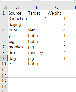
需要的数据类型为csv文件,一列为source(起点),一列为target(起点到达的点),一列为weight(边权重).

例如:

Gephi教程视频:
Gephi教程视频

AxGlyph

AxGlyph可以用来绘制一系列的示意图和物理图

AxGlyph教程视频

Visio

Visio快捷键

常用网站

pyecharts

matplotlib

阿里图标

ColorSpace

folium